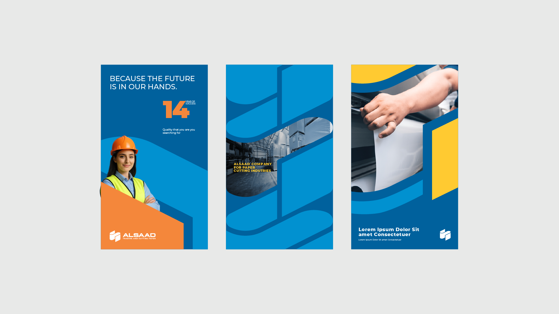
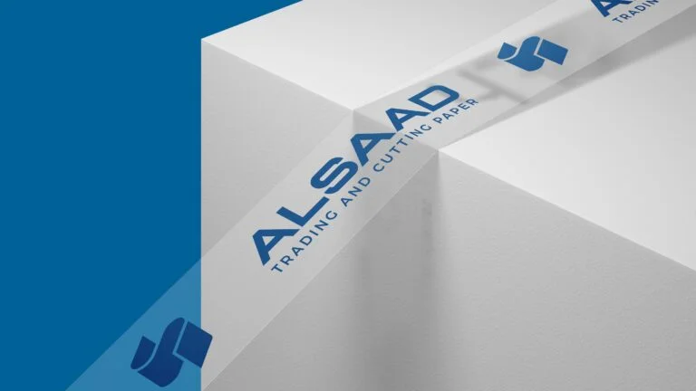
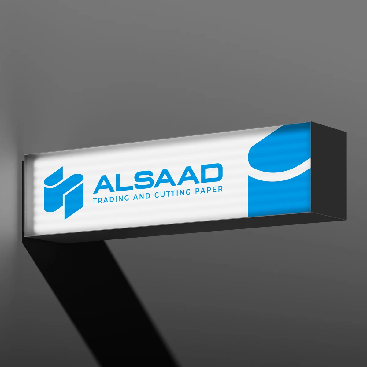
Branding :
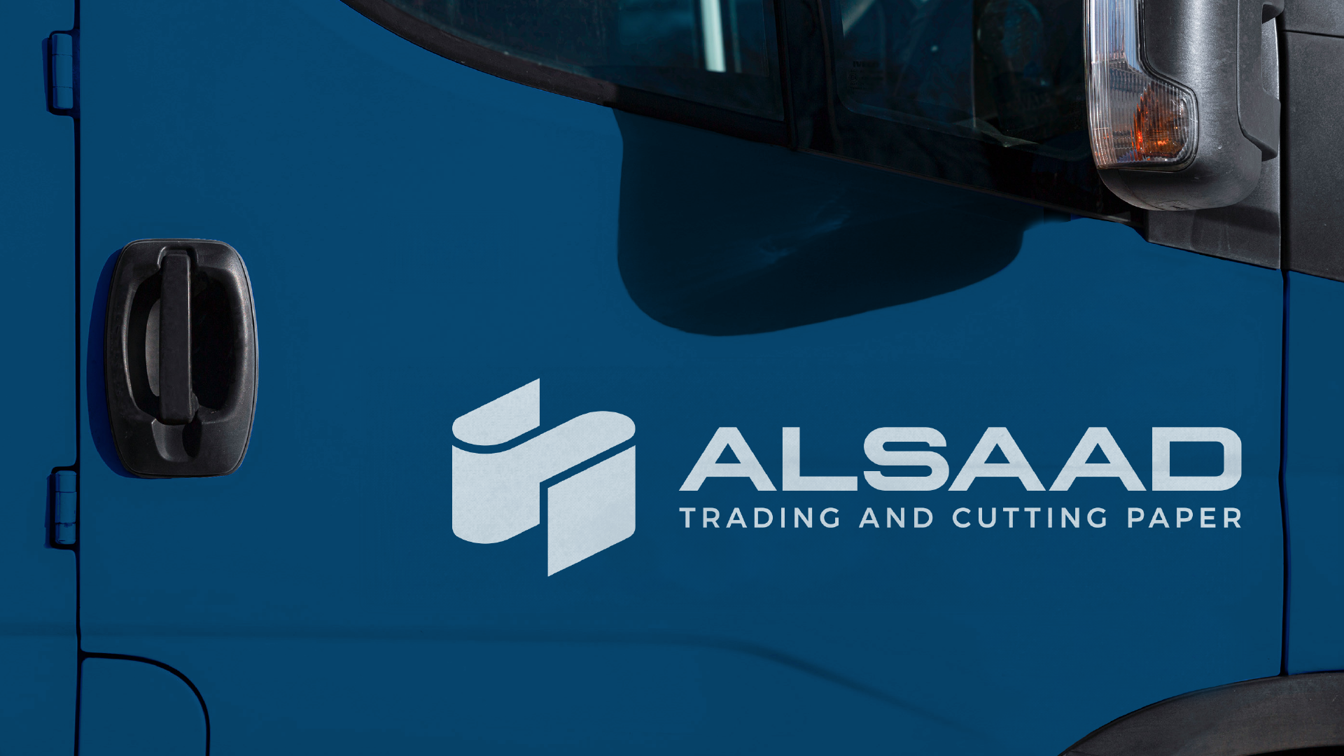
We designed the brand mark to capture the rhythm and flow of the paper trading business. By stacking paper rolls into the shape of an “S”, the logo becomes a smart visual metaphor .. standing for both the product and the streamlined supply it represents. The clean lines and structured form reflect the brand’s efficiency, reliability, and deep connection to the paper industry. It’s a simple idea, executed with clarity and purpose.
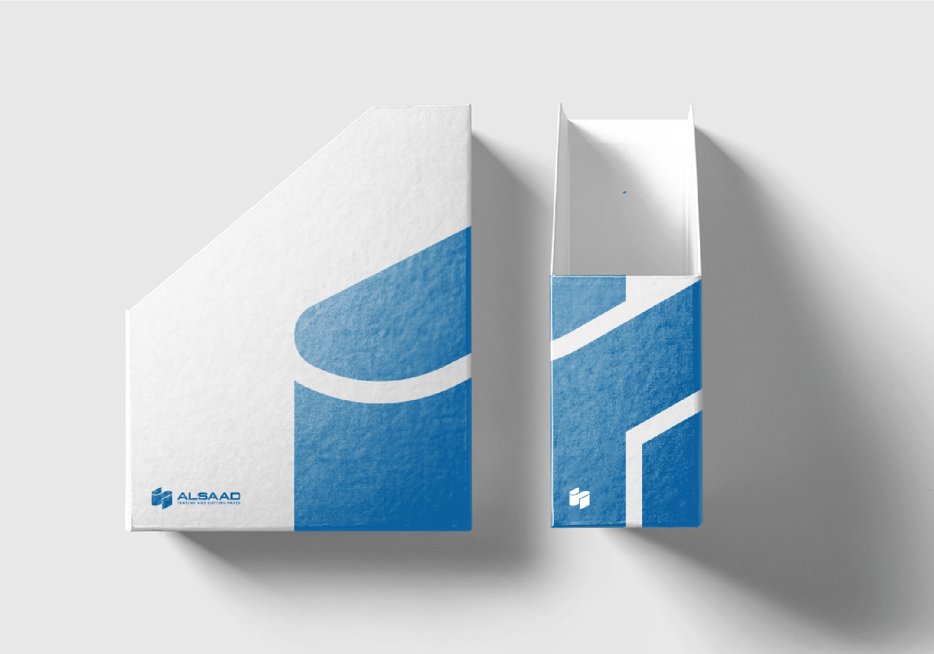
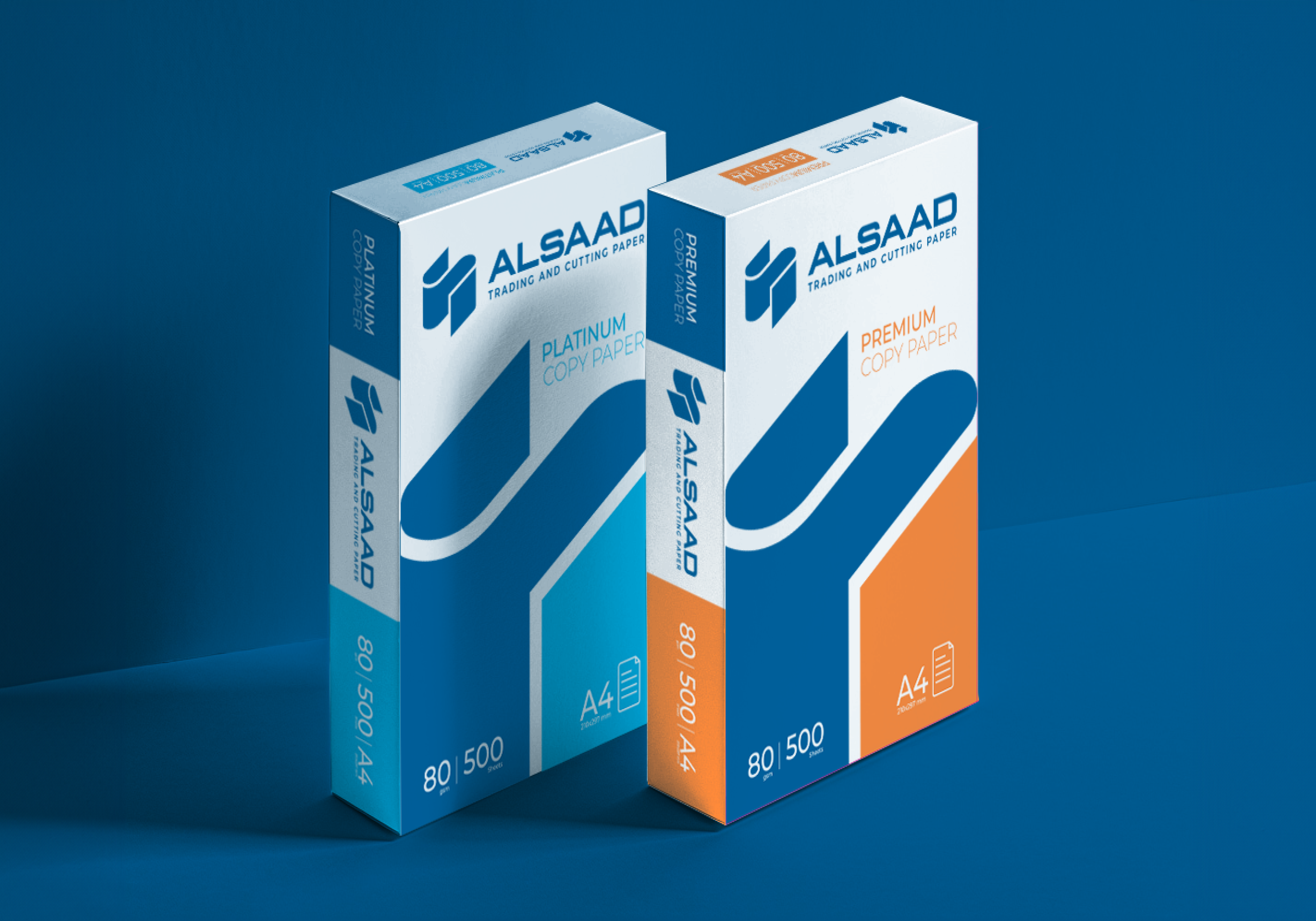
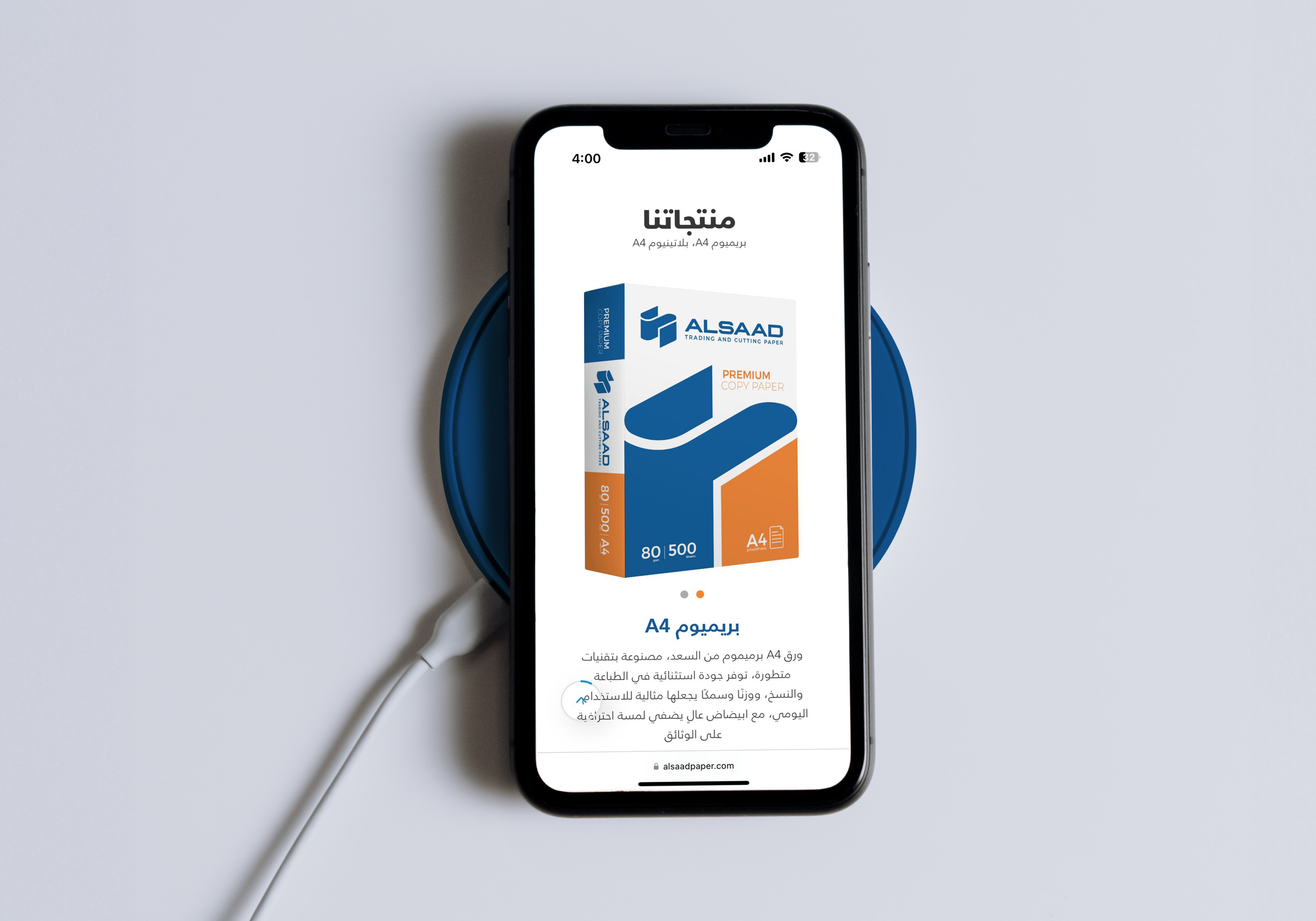
Packaging :
We extended ALSAAD’s new visual identity into modern, streamlined packaging designs. The visuals build on the logo’s stacked paper roll concept, reflecting structure, clarity, and movement. The final packaging captures the brand’s focus on order and efficiency in the paper trading industry, with a minimal and professional look.